
Understanding the 9.7″ iPad Pro’s Display: How DCI-P3 & True Tone Work
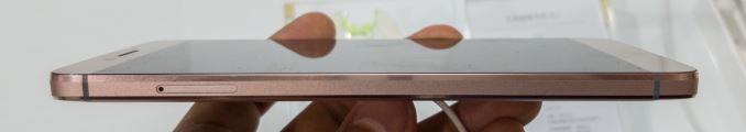
Earlier this month Apple launched a smaller version of the iPad Pro. At 9.7″ it essentially takes the place of the iPad Air 2 as Apple’s flagship standard sized tablet. While many observers expected it to simply be a smaller version of the larger iPad Pro, the launch event brought a number of surprises which made it clear that this new iPad was not simply a miniaturization of the larger model. While I plan to go over all of the specifics in our full review, I did want to address some confusion I’ve seen regarding one of the key new aspects of the 9.7″ iPad Pro, which is its display.
DCI-P3 Gamut Support
Like Apple’s newest version of their iMac with 5K Retina display, the new iPad Pro boasts support for the DCI-P3 color gamut. The DCI-P3 standard has been used for theatrical projection for quite some time now, and Apple’s marketing specifies that the displays have a 25% greater color saturation than the sRGB displays on previous iPads. Of course, with larger color gamuts comes a need for color management, and it’s worth noting that Apple only makes mention of color saturation in their marketing. The topic of adherence to the full DCI-P3 standard is something I’ll be covering more in the full review as well, but at this time there are some important details that are already known.
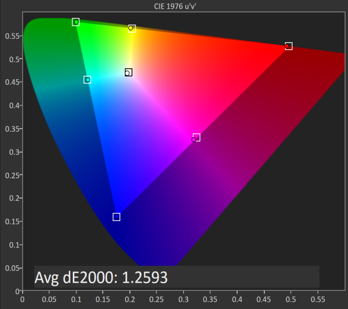
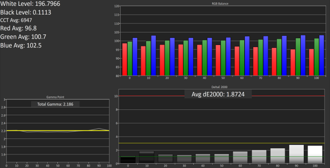
iPad Pro 9.7″ Display Saturation Accuracy (DCI-P3)
As you can see in the image above, the 9.7″ iPad Pro has no trouble covering the DCI-P3 color gamut. With an average DeltaE of 1.2593, the errors in 100% saturations are basically imperceptible, and in truth the greatest contribution to the error is actually the white point which is still slightly blue shifted in the display’s standard mode like most Apple devices are.
With a larger color gamut, my biggest question was how Apple was handing color management. A simple explanation of color management is that it’s the process through which a device should transform the original colors of a piece of content into a display’s target color space. Effective color management is critical for dealing with content that doesn’t match a display’s color space, in this case of course ensuring sRGB content is rendered correctly on a DCI-P3 display.
In the mobile world we’ve seen a number of problems crop up due to lacking color management, such as the natural oversaturation that exists on essentially all shipping AMOLED displays when they’re not running in a manufacturer-provided sRGB mode. Given that iOS has had absolutely no form of color management, I was curious as to how Apple planned to target the issue. OS X is by far the best color managed OS in the desktop world, and with iOS and OS X sharing many common parts it seemed natural that Apple would bring the color management from OS X to iOS. Sure enough, that’s exactly what they did.
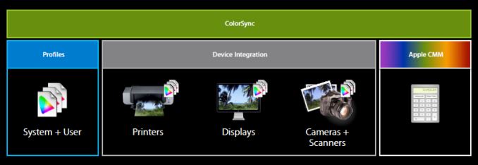
Since around the time of iOS 8 Apple has been improving color management support in their APIs for iOS. With 9.3 iOS essentially has full support for ColorSync in the same way that OS X does. ColorSync has been Apple’s system for color management for many years now, and it works very well in applications that are built on top of Apple’s frameworks like Quartz, Core Animation, and the entirety of AppKit. It just so happens that basically every iOS application is built on these frameworks, and so the task of building system-wide color management in to iOS was seemingly not a difficult one.
Color management appears to be working quite fine across the entire system and within all apps. The interesting thing is, the sign that color management works is the fact that for almost all content there is absolutely no difference between the new iPad Pro and the iPad Air 2. This is expected, as almost all content on the device will target the sRGB gamut, and so if color management is working it should be mapped into the larger DCI-P3 gamut without issue.
Apple’s own applications interpret untagged content as sRGB, and also properly understand tagged images and videos and display them correctly. Safari also renders CSS colors correctly, which is something that can’t be said for any other browser that I’m aware of. The same is true of all third party apps that I’ve tried, including Dropbox, Google Drive, AVPlayerHD, Animuplyr, among many others. While I had worried that iOS’s lack of color management prior to 9.3 would lead to many problems with accurate images on the 9.7″ iPad Pro, Apple has handled the situation better than I ever expected.
The 9.7″ iPad Pro’s display does have one oddity, which is its gamma. It still targets a power 2.2 gamma rather than the power 2.6 gamma defined for the DCI-P3 color space. While this may seem odd, I believe on iOS it’s simply a carry over from OS X. Apple’s newest iMac with Retina display uses the same gamma target, and in that case I believe it is used to preserve proper greyscale rendering in applications that may not play nice with ColorSync. While this isn’t really a problem on iOS, it allows better consistency between all of Apple’s devices using the wider DCI-P3 gamut.
Using a different gamma function may seem like a problem for the rendition of future DCI-P3 content, but in practice it actually won’t be an issue. Apple separates the actual DCI-P3 standard from their target which they call Display P3. This means that if content on the device does actually target the DCI-P3 gamut with a power 2.6 gamma ColorSync can simply perform a transform to render it correctly on the display. While it’s a bit of a cliché, it does seem that Apple has made the task of color management simply “just work” in most respects for both developers and users.
True Tone
In addition to adopting a significantly wider color gamut, the 9.7″ iPad Pro’s display has been branded as a True Tone display by Apple. Apple originally used this branding for the flashes on their iPhone cameras from the iPhone 5s onward, as they used a combination of light from two LEDs to produce a more natural white light relative to the surroundings than a single LED flash would be able to. The iPad Pro’s True Tone display follows a similar principle by adjusting the white point of the display depending on the ambient surroundings. I’ve done a few tests to see the extent to which True Tone changes the appearance of the display, and I think the data will help clear up some misconceptions regarding this feature.
To take a look at the True Tone display from a more academic standpoint, I’ve decided to measure the 9.7″ iPad Pro in three situations. The first is with True Tone disabled entirely, and so this corresponds to the display’s native calibration. The second is with True Tone enabled, and the iPad Pro placed in a controlled area where the only surrounding light was provided by 3000K bulbs. This was to test True Tone in an environment where the ambient light is of a warmer temperature, much like you’d get when in sunlight or in a room lit by incandescent or sodium lamps. The last test was similar to the second one, but with the light being provided by 5000K LED bulbs to see how far True Tone shifts the white point when the lighting is close to the levels that the standard calibration already targets.
True Tone Disabled

Because the overall accuracy isn’t really the focus here I’ve just done an eleven point greyscale measurement, and so I wouldn’t read too much into how straight the gamma is based on this test. It’s also worth noting that I’ve done these with the sRGB gamut as a target, which is for a reason that will become clear soon. What we can see is that the iPad Pro is quite accurate in its default mode, although the white is still more blue shifted than the 6504K target we desire. Rendition of color mixtures is excellent, and it’s clear that color management is working because they’re rendering correctly within the sRGB gamut.
True Tone With 3000K Lamps

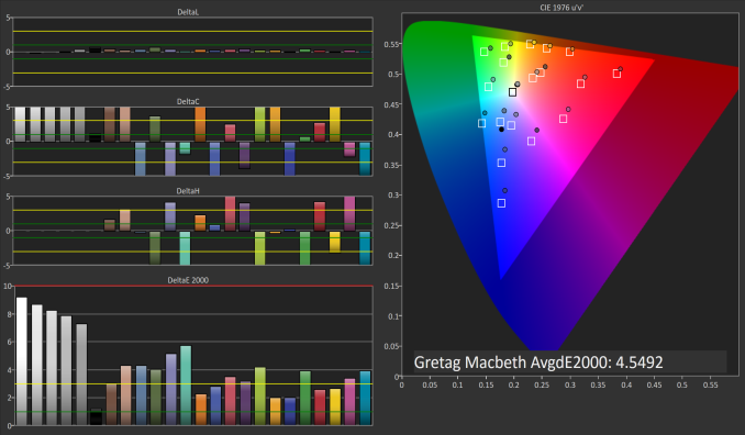
As I expected, color accuracy drops significantly when using True Tone in warm ambient lighting. I’ve seen a number of claims that True Tone is able to somehow maintain color accuracy while shifting the greyscale and white point, and that isn’t really possible because you also shift chroma and hue. It’s important to note that the entire point of True Tone is to make the display appear matched to your ambient lighting, and in this regard it does its job perfectly well. However, color accuracy suffers as a result, and this is a fairly obvious result so I’m not too sure where some of the confusion has been coming from.
As for how far True Tone alters the display, you can see that the blue contribution to luminance drops significantly, and the colors on the display are all shifted toward red which causes visible inaccuracy with blues, and obviously large inaccuracy with shades of grey. The white point average drops to 5388K, and while it’s difficult to photograph, the display definitely appears to match my perception of what white looks like in that lighting much better than the iPad Air 2 which just hovers around 7000K in every situation.
True Tone With 5000K Lamps


With 5000K lamps providing light, the color shift provided by True Tone is actually quite minimal. The white point average drops to 6404K, which is actually closer to the target than with True Tone disabled. Greyscale and color accuracy actually increases too which is great, and I wouldn’t mind having this as the standard mode, although it would take a toll on battery life due to the LED backlights being more efficient with a blue shifted white than a red shifted one.
Ultimately, True Tone is a success at what it attempts to do, but one shouldn’t believe that they’re going to be seeing greater color accuracy with it turned on than they do when it’s off. Anyone using the iPad Pro for color critical work will disable True Tone while the average user will find keeping it on provides a display that is pleasing to the eyes in any ambient lighting.
One final point I want to address is how True Tone relates to the inclusion of the DCI-P3 gamut. I’ve seen some speculation that the wider range of colors in the P3 gamut is what enables True Tone, but this isn’t the case. As you can see in the 3000K test above, even with True Tone enabled and the ambient lighting being as warm as household lighting goes, every color still lies within the sRGB gamut. There is an exception with one shade of orange, but it’s barely outside and the fact that the rendering is actually incorrect means that if it were to be pulled back in it would actually look more correct than it did in that situation. In any case, the fact that the colors still lie within the sRGB gamut means that the inclusion of DCI-P3 support at the same time is purely coincidental. If you happened to bring your iPad Pro into a darkroom where the only light was provided by a red lamp you may see colors shift outside the sRGB gamut, but I don’t think that’s a very common scenario.
In summary, I would say that the 9.7″ iPad Pro’s display is a significant improvement over the iPad Air 2 and the larger iPad Pro purely due to the wide gamut support. DCI-P3 will be the gamut to have when UltraHD content rolls around, and Apple choosing it instead of Adobe RGB was a well planned move. While it’s not very relevant now, it certainly will be in the future, and Apple has already ensured that iOS and its app ecosystem manages color correctly to render sRGB content and DCI-P3 content correctly.
As for True Tone, it definitely succeeds at doing what it claims to do. The display seems more natural when your eyes have adjusted to ambient lighting, but color accuracy inevitably suffers because of it. The fact that the wider gamut and True Tone showed up at the same time is basically just coincidence, and the two features are really orthogonal. True Tone works on a similar principle to Apple’s Night Shift feature, but in a dynamic sense based on ambient light rather than on the time of day, and there’s no need for a wider color gamut for it to work correctly because the largest change being made is just an alteration to the display’s gamma curves.
While True Tone and DCI-P3 gamut support are interesting, it’ll take a full review for me to examine the color accuracy when rendering sRGB and DCI-P3 content in greater depth. I’d also like to take a look at how True Tone alters the display based on ambient brightness while maintaining the same ambient color temperature, which is a bit difficult with my current setup. I also plan to introduce some additional testing from our monitor suite, and Apple’s claims of an improved anti-reflective coating will be something to investigate as well. There’s more to come about the 9.7″ iPad Pro, so keep an eye out for the review in the near future.